# The Box Model
When browsers render our page, they represent every element as a rectangular box. They may appear to have different shapes, like slanted or rounded, but underneath they are all bound inside a rectangular box. A good portion of what we do when styling with CSS is manipulating these rectangular boxes, like changing their dimensions or spacing between other boxes.
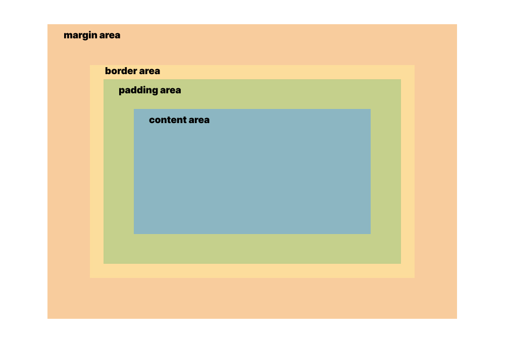
Every rectangular box is composed of four areas that we can modify individually: the content area, padding area, border area, and margin area.

# Content Area
The content area contains the "real" content of the element, such as the text or image that it represents. Its size automatically fits the size of the element's contents, but can be explicitly overriden with CSS.
Here are the CSS properties that affect the size of the element's content area:
width(opens new window)height(opens new window)min-width(opens new window)min-height(opens new window)max-width(opens new window)max-height(opens new window)

# Padding Area
The padding area is the the space between the content area and the edge of the element. This area is transparent, but we know that it's there based on the spacing between the content and the edge of the element.
Here are the CSS properties that affect the size of the element's padding area:
padding-top(opens new window)padding-right(opens new window)padding-bottom(opens new window)padding-left(opens new window)padding(opens new window)

# Border Area
The border area is the edge of the element itself. It's usually not visible by default, but with some CSS we can show it to provide a border around the element's boundaries.
Here are the CSS properties that affect the size of the element's border area:
border-top-width(opens new window)border-top-style(opens new window)border-top-color(opens new window)border-right-width(opens new window)border-right-style(opens new window)border-right-color(opens new window)border-bottom-width(opens new window)border-bottom-style(opens new window)border-bottom-color(opens new window)border-left-width(opens new window)border-left-style(opens new window)border-left-color(opens new window)
Most of the time we'll be using the shorthand versions of these properties:
border-top(opens new window)border-right(opens new window)border-bottom(opens new window)border-left(opens new window)border(opens new window)
We can also make the border appear rounded using the border-radius (opens new window) property.

# Margin Area
The margin area is an invisible space beyond the boundaries of the element and is used to separate it from other neighboring elements. Margins can also have negative values, allowing us to overlap elements with each other.
Here are the CSS properties that affect the size of the element's margin area:
margin-top(opens new window)margin-right(opens new window)margin-bottom(opens new window)margin-left(opens new window)margin(opens new window)

# Overall Element Dimensions
In order to determine the total width of an element with all the CSS applied, we sum the values of border-left-width, padding-left, width, padding-right, and border-right-width.
In order to determine the total height of an element with all the CSS applied, we sum the values of border-top-width, padding-top, height, padding-bottom, and border-bottom-width.
Let's say for example we have the following CSS rule:
div {
  width: 100px;
  padding-left: 20px;
  padding-right: 20px;
  border-left: 10px solid red;
  border-right: 10px solid red;
  margin-left: 50px;
  margin-right: 50px;
}
This gives us a <div> with an overall width of 100px + 20px + 20px + 10px + 10px = 160px. The margins don't affect the overall element dimensions. This is the standard CSS box model.
The standard box model behavior can get inconvenient when we want to style an element to have a specific overall width or height. Let's say we want to style an element to have exactly 500px overall width, but if it has paddings or borders we need to subtract those values from 500px in order to determine what value to set for the width property.
To make things a bit more complex, there is also an alternate box model, which allows us to set the overall dimensions of the element with width or height. Any borders or paddings we specify doesn't add to the overall dimensions of the element, but instead removes from the size of the content area.
We can switch to the alternate box model using the box-sizing (opens new window) property. Here it is added to the same code example above:
div {
  box-sizing: border-box;

  width: 100px;
  padding-left: 20px;
  padding-right: 20px;
  border-left: 10px solid red;
  border-right: 10px solid red;
  margin-left: 50px;
  margin-right: 50px;
}
Because this is now using the alternate box model, this gives us a <div> with an overall width of 100px. The borders and paddings are subtracted from the overall width to get the width of the content area, which is now just 100px - 20px - 20px - 10px - 10px = 40px.